Subscribe to the daily newsletter.

Yorica! gets “supercool” branding from Brandon

yorica

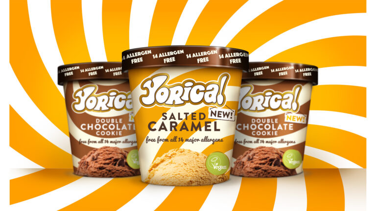
Brandon has completed the new look for free-from frozen brand, Yorica!.

The Manchester agency was appointed as Yorica! launches into the retail sector.

It was tasked with creating a new identity and packaging design, to help it evolve from being a cult ice cream parlour, to have a product suitable for supermarket shelves.

“Yorica! has a devoted following that love it, and we were extremely careful to respect that. We’ve taken the brand on a journey, while elevating the product for the retail trade, driving stronger premium cues and disrupting with a patter that stands out like a sore thumb. It was critical that we disrupt in such a competitive and noisy ice-cream aisle,” explained Brandon’s Richard Taylor.

integated_0
Submit your information by this Friday
Coming Soon: The Prolific North Top 50 Integrated Agencies


Taylor added that while its stores have a distinctive “1960s-inspired free-spirit” identity, they believed this wouldn’t necessarily work in retail.

Instead, Brandon took some of the elements and “amplified” them. This included gold halos around the brand mark and Vegan Society symbol. It’s also highlighted the allergen free messaging.

“Brandon has come up with an exciting new brand identity that will help us to take Yorica! to the next stage of its life without losing sight of who we are and what we stand for,” said Simon Foster, group managing director at Yorica!.

“Yorica! is now ready for a wider audience outside of London. The design is both simple and iconic, and, most importantly, easy for people to understand at speed towards the end of a busy shop.”

Related News