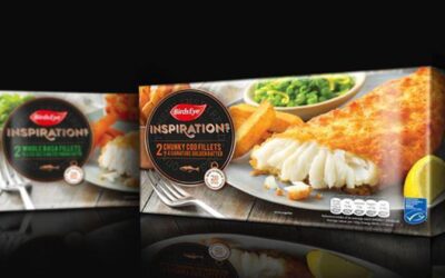

Brandon has completed a rebrand of Birds Eye’s frozen ready meals, hoping to “dial up authenticity and quality.”
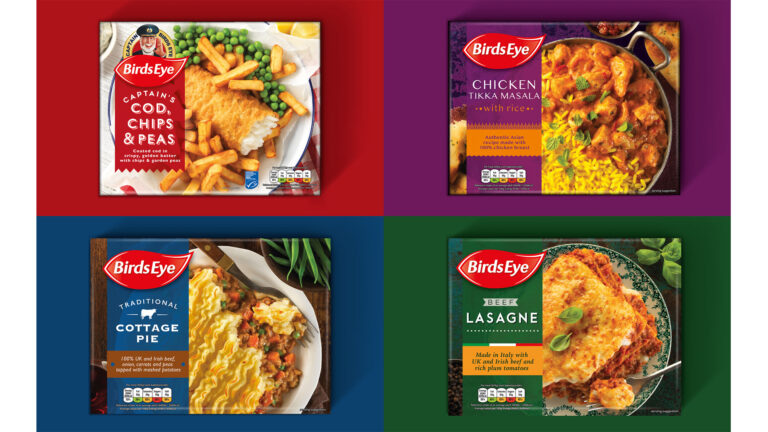
The Wilmslow agency was briefed to take a fresh look at the packaging design to modernise and revitalise its range, as well as making them feel like a family of products, which is easier to navigate.
“We needed to create a range of products that looked like they were part of the same family, while at the same time developing authentic country cues to help set apart the Italian from the Indian and British meals. We also had to stay true to the Birds Eye brand, with its long heritage and mass awareness,” explained Richard Taylor, managing partner, Brandon.
They used modern dining photography, more commonly used in the convenience chilled aisles to convey “authenticity and tastiness.” The packaging was also simplified and standardised to make differentiate between each variant.
“We really focused on the attention to detail in the photography, exploring all the little elements that would dial up authenticity of the cuisine. From typography and photography to background colours, propping and placement of logo and product description,” added Steve Conchie, creative director, Brandon.
“It was vital that we raised the quality cues on pack, so borrowing photography cues from chilled convenience meals was key to enticing more consumers into buying frozen ready meals from Birds Eye.”
Alessandro Solazzi, general marketing manager at Birds Eye, said:
“The new design has refreshed the look of our range of frozen ready meals, bringing it up to date and ready to compete with the convenience chilled sector. It also enables consumers to quickly understand the quality and authenticity of the range.”