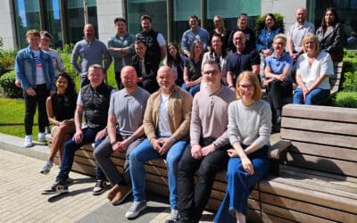


Liverpool creative agency Hopeful Studio, which focuses on work with purpose-led clients, has undergone its second brand transition in as many years having initially rebranded from Design Integrity in April 2022.
Since that initial rebrand, the company has been nominated as Independent Agency Of the Year 2023 at Prolific North’s Champions Awards and found success helping transform NGO’s, SE’s and STO’s through brand & digital strategy.
Among some of the results from recent initiatives, a re-brand with a racial harmony organisation helped the NGO acquire Vodafone as a client, while a digital piece for a charity saw a return of over 700 downloads in just over six months.
Despite the undeniable successes since the 2022 shift in positioning, the company felt that the original transition, and resulting visual identity, was “slightly rushed,” in part because, with key client accounts being implemented during the pivot, it was hard for the studio to address its visual identity with real focus.
This year, with some projects coming to an end and a short respite available before new ones kicked off, the studio spent time developing a more considered identity it feels has longevity and provides a platform to scale.
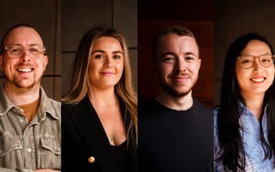
Founder and director Stephen Murray said: “For us, a brand is an idea that exists beyond a product or service. The big brands do this well, and so give themselves room to offer a range of services within an ecosystem of values and principles. That’s what Hopeful is for us. It’s a value system centred on positivity and celebration.
“Hopeful Studio is very much built on a variety of learnings and innovations in the brand and digital field that offer great value to charities, social enterprises, challenger brands and larger initiatives that pursue different types of social impact.”
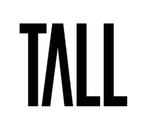
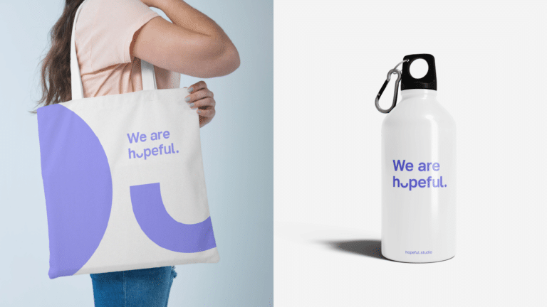
With a vision to scale up threefold in the next two years, Murray felt the studio needed a more robust identity to reflect that. A simple san serif led identity, with one glyph element slightly irregular in the logo, resembling a smile, or perhaps a glass half full.
He added: “This simplicity of meaning and imagery offers space and room for clients and partners to co-exist with us effortlessly. It also empowers us to be memorable. If an identity is not memorable, it’ll struggle to build any traction in its market.”