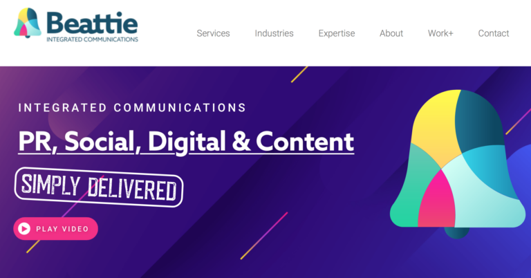

Integrated agency Beattie, which has offices in Manchester and Leeds, has launched a new corporate identity.
It highlights Beattie’s “integrated offering across services, sector specialisms, marketing expertise and geography”.
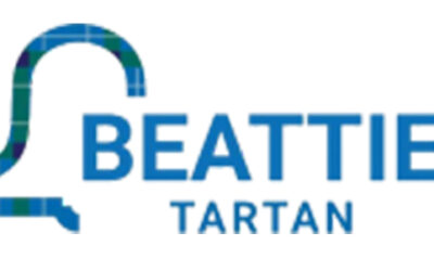
The bell, which has been the agency’s symbol for more than 30 years, has been retained but presented in a more dramatic and colourful fashion.
Rachel Gladwin, director of Beattie’s North and Midlands division, said: “When it comes to branding, we believe in evolution, not revolution.
“Too many brands make the mistake of throwing the baby out with the bathwater. We were keen to avoid that blunder.
“We’ve made the Beattie bell more impactful than it’s ever been by adding a rainbow of colours that signify our joined up approach to marketing and communications.
“We also joined up the middle letters in the Beattie name, while leaving the B and final E independent. Hence our focus on Be Integrated, Be Specialist, Be Expert and Be Across The UK. Our thinking behind our new branding is explained in our latest showreel which went live today.”
The new logo was designed by the agency’s in-house team who are currently redesigning corporate identities for clients in the UK, North America and Germany.
Beattie, has the biggest footprint of any integrated communications agency, with office hubs in London, Birmingham, Leeds, Manchester and Glasgow.