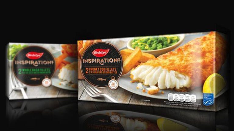

Birds Eye says it’s hoping to disrupt the frozen fish sector, with a new identity and packaging, created by Brandon.
The Wilmslow agency has redesigned its Inspirations products, by making the sub-brand’s logo more prominent than Birds Eye, to encourage recognition.
It has also used a more prominent, editorial-influenced photography style.
“Packaging design within the premium frozen fish category was all beginning to look like wallpaper, with every brand opting for full-on black packaging to create a premium feel. As a result, no one brand was standing out,” explained Brandon creative director, Steve Conchie.
“The bright editorial style food photography taken from the fresh ready meals sector gives Inspirations cut through. Our design makes it simpler to both decode the premium nature of the product with plenty of quality craft cues, but also for shoppers to find what they are looking for at speed, by promoting the product benefits for each of the various ranges within Inspirations.”
The new identity is being rolled out this month.
“The new identity and packaging design helps our range stand out from the competition and effectively communicates its premium qualities. Consumers love going out for dinner but the work by Brandon shows them they can have that bistro experience at home, without the expense of eating out or cooking in the kitchen all evening,” added Andrew Elder, general arketing manager, Birds Eye.