

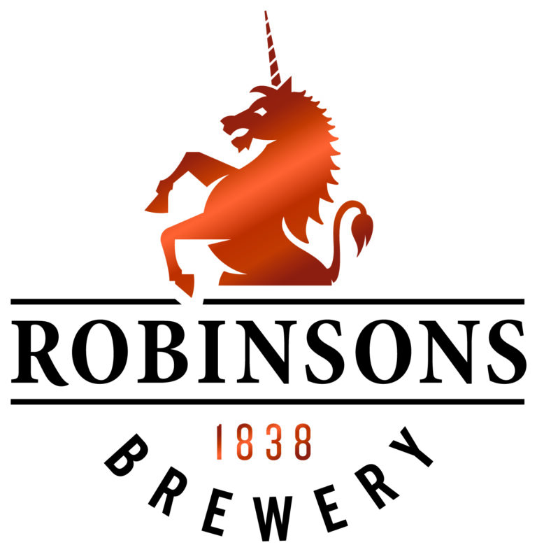

Manchester agency Truth Creative has unveiled a new logo for Robinsons, the Stockport-based brewery.
The new design is part of a complete rebrand and will include fresh pub signage for its 300-plus pub estate, as well as new pump clips, bottle labels, merchandise and literature and corporate website.
 Robinsons’ new logo
Darren Scott, founder and creative partner of Truth, said: “We have modernised, refined and simplified the brand mark to be bolder, more dynamic and future proofed.
“The new brand identity is therefore distinctive without detracting from the unicorn motif, which has formed the backbone of Robinsons’ respected lineage and represents the company’s values as an independent family brewer.
“Likewise, we have harnessed the colour copper because as a material it is intertwined with the craft of brewing and beer.”
Truth is currently working on other aspects of the rebrand.
Oliver Robinson, joint MD (Beer Division) of Robinsons Brewery, added: “As custodians of our family business we have now reached a point to move forward with its development and in doing so take a tighter control of our image, how we portray ourselves and importantly our tone of voice.
“Following heavy investment in our pubs, brewery and beers, we felt it was the perfect time to brew a new look and redefine our positioning.”