


Independent agency Brandon Consultants has unveiled a redesign of the iconic Imperial Leather brand, recrafting its heritage logo and overhauling packaging across the product range.
The project, created for PZ Cussons, introduces a new visual identity aimed at reconnecting the long-running bathroom brand with the design cues that first made it distinctive.
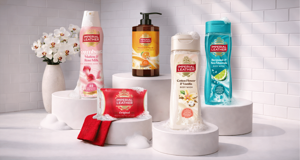
The work includes a refreshed wordmark, the return of the brand’s red ribbon asset and the revival of the crown logo, which had been dropped in recent design updates. The new identity also introduces updated colour palettes, typography and packaging structures across Imperial Leather’s soap, shower, bath and Foamburst ranges.
“Revitalising heritage brands is one of our specialities at Brandon and, when it comes to the bathroom, there isn’t a brand more steeped in heritage than Imperial Leather. In recent years, the washing and bathing category has evolved, and so has Imperial Leather. What had become clear was that the brand had shifted too far from what made it iconic in the first place, and it was at risk from competitors. Our challenge was to help the brand stand strong in a changing category, rebuilding its distinctive brand assets to re-establish brand recognition and desirability amongst consumers who had begun to look elsewhere,” said Richard Taylor, Co-Founder of Manchester-based Brandon Consultants.
Consumer research carried out during the project highlighted the importance of reinstating the crown motif to strengthen brand recognition and reinforce Imperial Leather’s heritage positioning.
The redesigned crown incorporates updated references to fragrance, water drops and swirling lather while maintaining the brand’s historic visual cues.
The wider identity is built around the idea of “abundance”, with the design system introducing new fragrance cameos, swirl and foam textures and a reset colour palette centred on the brand’s traditional red and gold.

“Balancing the old with the new, the sophisticated with the accessible, it was also important that we communicated the dualities of lather and fragrance that Imperial Leather products are known and loved for. Our new sensorial graphic language for Imperial Leather feels fresh yet classic, and it speaks to the brand’s sense of generosity and the concept of everyday pleasure. To complement our recrafted wordmark, we created a new set of key brand assets, including sophisticated fragrance cameos and our swirl and foam textures, all of which conjure up the indulgent experience of using the products,” added Katie Rowley, Design Director at Brandon Consultants.
Alongside the new identity, Brandon has developed updated packaging design principles across Imperial Leather’s portfolio to create clearer hierarchy and stronger differentiation between product ranges while maintaining a consistent masterbrand look.
“Imperial Leather is renowned for its rich lather and signature fragrance. Our brief to the Brandon team was to creatively and visually bring these qualities to life, revitalising the brand in a way that reconnects with what consumers have always loved about it. The result is an enduring, iconic and distinctive design and together we have reset Imperial Leather as a desirable and – importantly – relevant brand for today and the future,” said Sophie Daniels, Senior Brand and Innovation Manager at PZ Cussons.
The new branding and packaging is rolling out across the UK now.