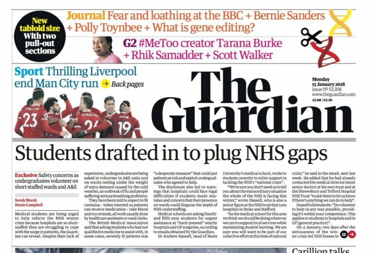

The Guardian newspaper has launched a new tabloid format as part of a major redesign and cost-cutting drive.
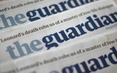
The well-known blue and white masthead has been replaced with simple black lettering and the website and app have also been revamped. Editor-in-chief Katharine Viner hailed the “beautiful new design that works for readers across mobile, apps and desktop.”
This is part of Guardian Media Group’s drive to break even by 2019. Printing of the paper has been outsourced to Trinity Mirror, with centres in Trafford, Manchester, and Stratford, London, to be closed. The company says this will cost up to 50 jobs but save £80m.
This is the first time in the newspaper’s almost 200-year history that it has gone tabloid. It was launched in Manchester in 1821 and, up until 1959, was known as the Manchester Guardian.
In 1964, the paper moved its headquarters to London. In 2005, it switched from broadsheet to a mid-sized Berliner format.
Viner said: “It’s been an exhilarating period of creativity, imagination and focus, and we’re thrilled with the result. We hope you like it.
“At the Guardian we have a special relationship with our readers. This relationship is not just about the news; it’s about a shared sense of purpose and a commitment to understand and illuminate our times. We feel a deep sense of duty and responsibility to our readers to honour the trust you place in us.
“We have grounded our new editions in the qualities readers value most in Guardian journalism: clarity, in a world where facts should be sacred but are too often overlooked; imagination, in an age in which people yearn for new ideas and fresh alternatives to the way things are.
“For several months, a team including our exceptional creative director Alex Breuer and senior editors and designers have been discussing and refining the Guardian’s new look, as well as gathering invaluable feedback from readers.
“We have introduced a font called Guardian Headline that is simple, confident and impactful. This was a collaboration with the design experts Commercial Type, who created the original Guardian Egyptian, and is easier to read. We’re using a range of energetic colours, and the much-loved Guardian visual wit and style remain at the heart of the look.
“The masthead has a renewed strength and confidence to represent the Guardian’s place and mission in these challenging times.”