
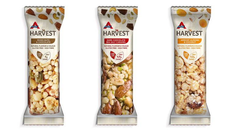

Brandon has created the new identity and packaging design for Atkins Harvest snack bars.
The packaging has been created to reflect the bar’s advertised health benefits, as well as standing out in the gluten free aisle.
The agency used a clear window to show the snack bar itself and its ingredients of nuts, seeds and fruit, which it says, are all gathered and foraged naturally.
It designed a 2-leaf graphic to sit at the top of the window and communicate key messages – that it’s carb-lite and has just 4.9g of sugar per bar.
“We wanted to let the naturalness of the products speak for themselves and the use of a large window to clearly display the bar, allows that immediate transparency. A simple colour palette of white, with three earthy shades communicates the three flavour variants, creating a much more product-reflective approach,” explained Steve Conchie, creative director.
“Due to the many health benefits of the product, it would have been easy for the packaging to have been flooded with messages, making it over-whelming for people to decode at speed. The simplicity of the transparent window, ingredient cluster and leaf graphic for the two key messages ensures the benefits are easily communicated.”