

Mark Studio has created the brand identity for new arts and cultural organisation, LeftCoast.
 Supported by the Arts Council, it’s been set up to get more people involved in arts projects.
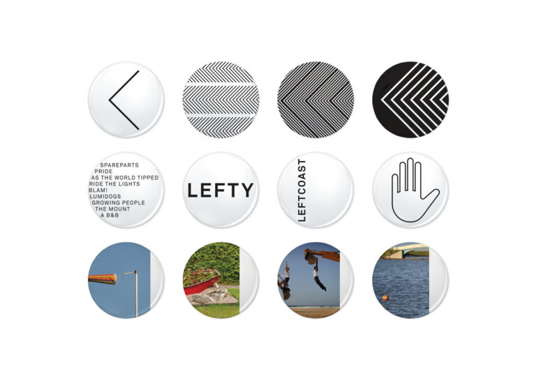
“The rules change by the coast. You can experiment and be free to express yourself. The coast does not hem you in – it connects you to the rest of the world. There is a creative license here you just don’t get in other places. Blackpool and Wyre are not the same as anywhere else,” explained Michael Trainor, LeftCoast artistic director.
Trainor also came up with the idea of the “leftness” of the brand, believing the audiences should move “an inch to the left.”
This idea has now become central to the new branding as Mark Studio’s Mark Lester explained:
 “Everything around the brand has been done to emphasis its ‘leftness.’ The ‘arrow’ is actually a stylised ‘L’ turned on its side,” he told Prolific North.
“In the brand guidelines we’ve said that all photography should be shunted to the left so that it almost looks wrong. Literature reads right to to left, all to subvert the norm.”
The project has only just been launched and a new website will be going live shortly.