Manchester’s City Tower has been rebranded to reflect both its modernisation and historical significance.
The redesign, including the new motto of “Backing the bold” was commissioned by Schroders Capital on behalf of its owners and undertaken by OBI.
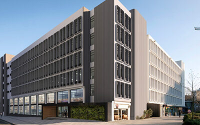
Built between 1959 and 1965, City Tower, previously known as Sunley House, remains one of Manchester’s tallest skyscrapers.
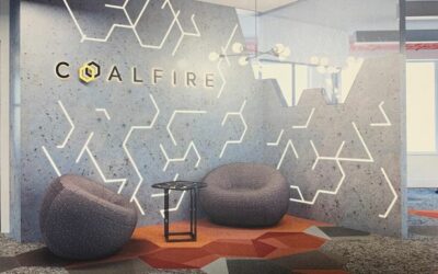
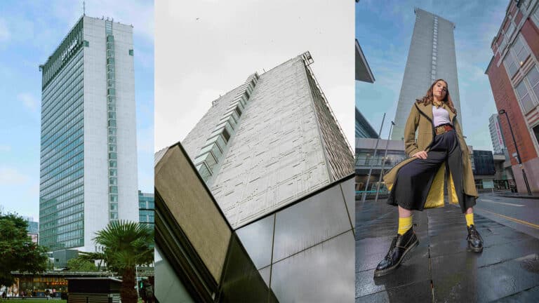
OBI said it was celebrating its “bold concrete facade” in the new branding, with icons to reflect the digital technology and “circuit-board-esque” design on the North East and South West elevations, plus “a gridwork style reminiscent of its block structure.”
“City Tower is the epitome of big and bold. Its unapologetic, brutalist aesthetic has stood proudly at the centre of Manchester for almost 60 years and we wanted to celebrate its forward-thinking design with the rebrand,” explained Alister Shapley, lead designer at OBI Property.
“The style is bold, eye-catching and modernist and the logo identifiers shift and reform like the building façade, whilst the numerous sub-brands align, but also provide room for slight distinction.
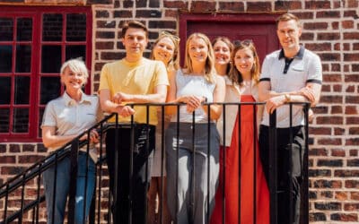
“The photography reflects City Towers’ tenants and features diversity across all genders, ages and ethnicities. They have been captured using striking angles, in dynamic compositions and have a fashionable finish.”
The firm has also designed a bespoke typeface for City Tower “to evoke a sense of height”, while the colour palette draws from 1960s tones of British racing green, dusty red, grey, and black.
“Schroders Capital is proud to manage this landmark asset situated at the Centre of Manchester and refresh the branding of this landmark asset at the Centre of Manchester, to better reflect the asset and its unique characteristics,” added Rob Prescott, Asset Manager at Schroders Capital.
“In order to reflect the vibrant diversity within the building and highlight its bold aesthetic, City Tower has undergone a comprehensive rebranding process. The new branding embodies the essence of the tower’s dynamic atmosphere, capturing its energy and forward-thinking approach.
“This is just the start of a busy period at the building and we’ll continue to communicate on its transition over the next months.”
A phased replacement of all existing branding is underway, with more than 900 pieces of signage, icons and wayfinding being updated in the process. A new website is being developed, too, alongside rebranding City Towers’ social channels.

