Liverpool agency, Ideas Department, has rebranded Warrington’s Golden Square Shopping Centre.
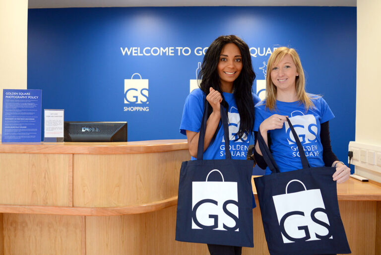
Art director, Andrew Altay came up with the bright blue square logo, with the GS initials to reflect “the clean, uncluttered, distinctive name and architecture of the centre.”
“We opted for a vibrant blue because many other large shopping centres in the North West, such as Liverpool One use red and Intu Trafford Centre now use orange. We wanted it to stand out from the crowd,” explained Altay.
“The three variations of the logo represent three important elements of the centre’s offering. The boutique bag for shopping and fashion; the simple blue square acts as a dining table to represent the growing food and beverage offering; and a jack-in-a-box represents the fun on offer all year round.”
The rebrand also includes the launch of a new customer service desk and new uniforms for the centre’s staff.
“Since its expansion and re-launch in 2007, Golden Square has evolved and is now home to many of the UK’s leading high street fashion and consumer brands, rivaling larger North West shopping destinations. So, the time just felt right to take the centre’s look to the next level,” added Ian Cox, Golden Square’s general manager.
“We have had a fantastic reaction from shoppers about the rebrand – they say it gives the centre a fresh new look which is right up there with our main objectives for this change.”


