They may not be a household name, but the chances are that you have seen the work of The Northern Block.
This week is a busy one for the collaborative type foundry, based just outside Newcastle. It’s hitting the big screen and releasing a new version of one of its most influential fonts.
The big screen debut comes for its Corbert Wide font, which is being used for some graphic titles in The Beatles: Get Back – The Rooftop Concert, which airs on IMAX screens in London and the US, before going nationwide later in the month. It also appeared in the main Disney+ documentary series.
Even so, it’s not their most famous piece of work.
Subscribe to the Prolific North Daily Newsletter Today!
Want all the latest content from Prolific North delivered direct to your inbox daily? Of course you do!
Led by designer, Jonathan Hill, The Northern Block’s typography has been used globally, such as Squarespace’s Super Bowl ad, the one featuring Winona Ryder. Their client list is pretty A-list too – Disney, Netflix, Lego, EA SPORTS, Vauxhall Motors, Google, Adobe and Hilton Worldwide amongst others.
Even so, Hill remains understated:
“I’m not sure whether it was my Northern upbringing, but I assumed type-designers already out there were better than I’d ever be.
“I was just starting out, and it took me a long time to develop that thick-skin and resilience necessary for advancement in this competitive field.”
From their office in Corbridge, Hill explained that designing a font requires: “engineering, precision and technical expertise”
“When designing a font, The Northern Block focuses on creating those that successfully translate across different languages and corporate applications, but also to meet the needs of the flexibility craved by creative professionals who can quickly adapt it to its environment, saving marketing professionals endless headaches and time.”
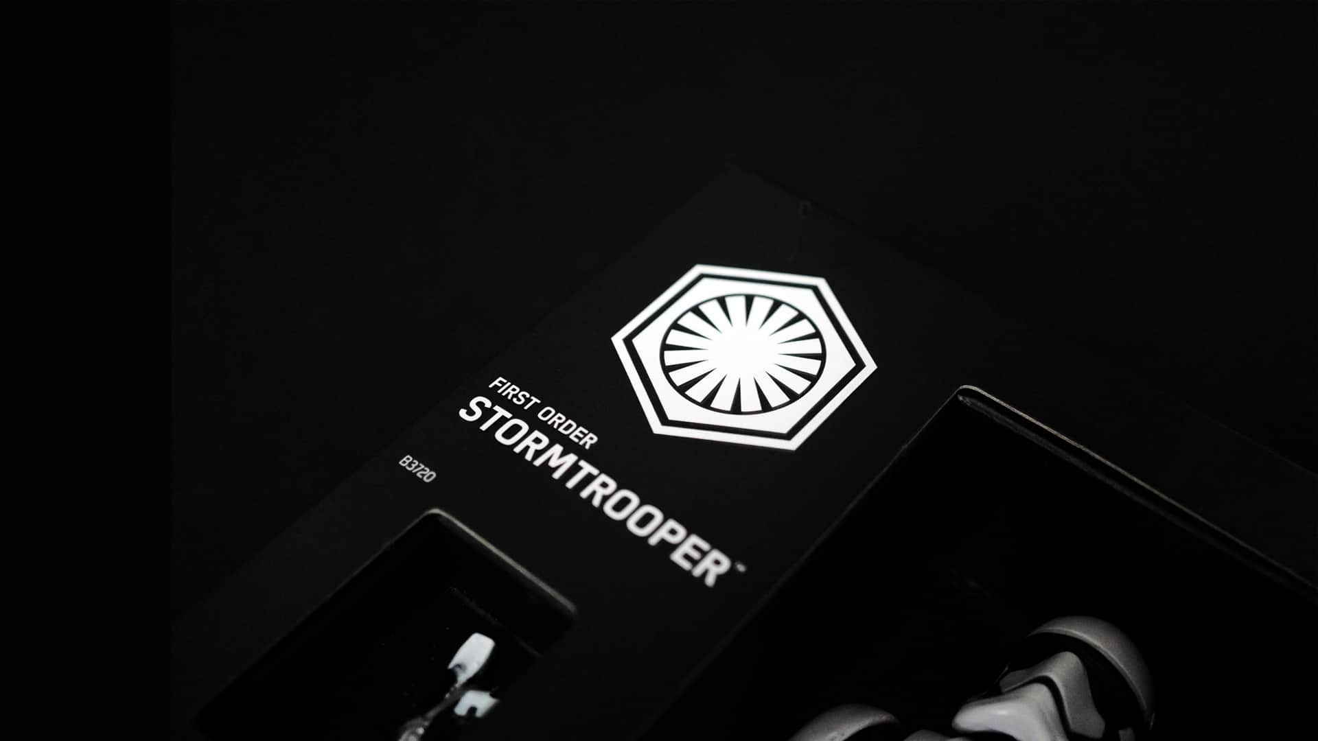
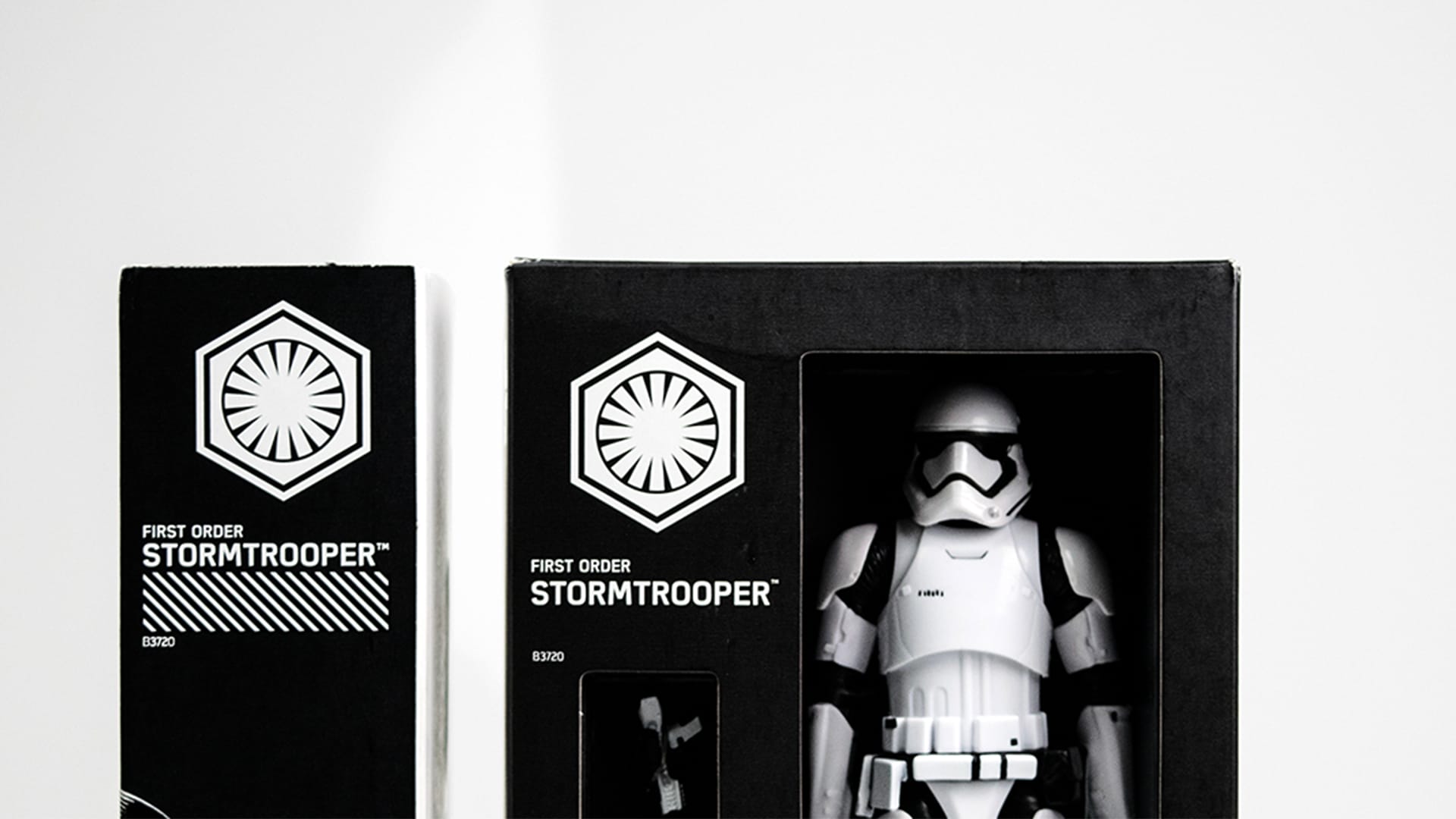
However, sometimes it’s the client which sees the real potential of their work. That was the case with its Eund typeface, which was chosen by Disney for Star Wars’ Black Series merchandise figures.
Hill conceded that he never anticipated that the font, born from the “bleak modernism of Nordic Noir” would one day be linked with the global franchise.
It was initially inspired by dramas, like The Killing and its minimalist style, hence Eund’s “tight geometric forms.”
Just in case you think this came about through high level meetings with Disney and LucasFilm, and maybe the odd trip to glamorous film studios, Hill explained that he only found out that the font was being used when he visited his nephews on Christmas Day.
He picked up the box of a Black Series Stormtrooper figurine, shocked to see the Eund font on it.
He admitted that without Star Wars, the font would have “disappeared into oblivion.”
”Just as I was accepting the fact that not every typeface will bring forth the same kind of influence sales started to build out of nowhere. They were a welcome reminder of the fact that hard work sometimes really pays off, even when you don’t expect it.”
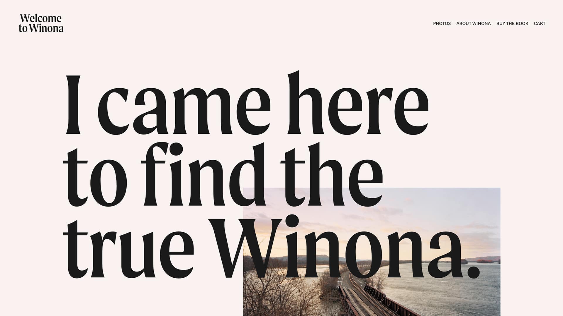
However, seeing his font during the Super Bowl in 2020, was a “Hollywood moment.”
Moret was picked by Squarespace to appear on its half-time commercial, featuring Stranger Things actress Winona Ryder.
He said it made him feel “like a film company had made my novel into a Hollywood blockbuster.”
“When I watched it, everything made total sense”, he explained.
“The premise of the advert was genius. It involved Winona Ryder going back to Winona the Minnesotan city to document life and the people – and to produce a website called welcometowinona.com. Unbelievably, the font she chooses and the one that appears on her website and associated book is Moret.”
The impact of broadcasting to almost 150m had a major impact on The Northern Block.
“Typefaces like Moret do make sales, but usually take a year or so to be incorporated into large-scale commercial work.”
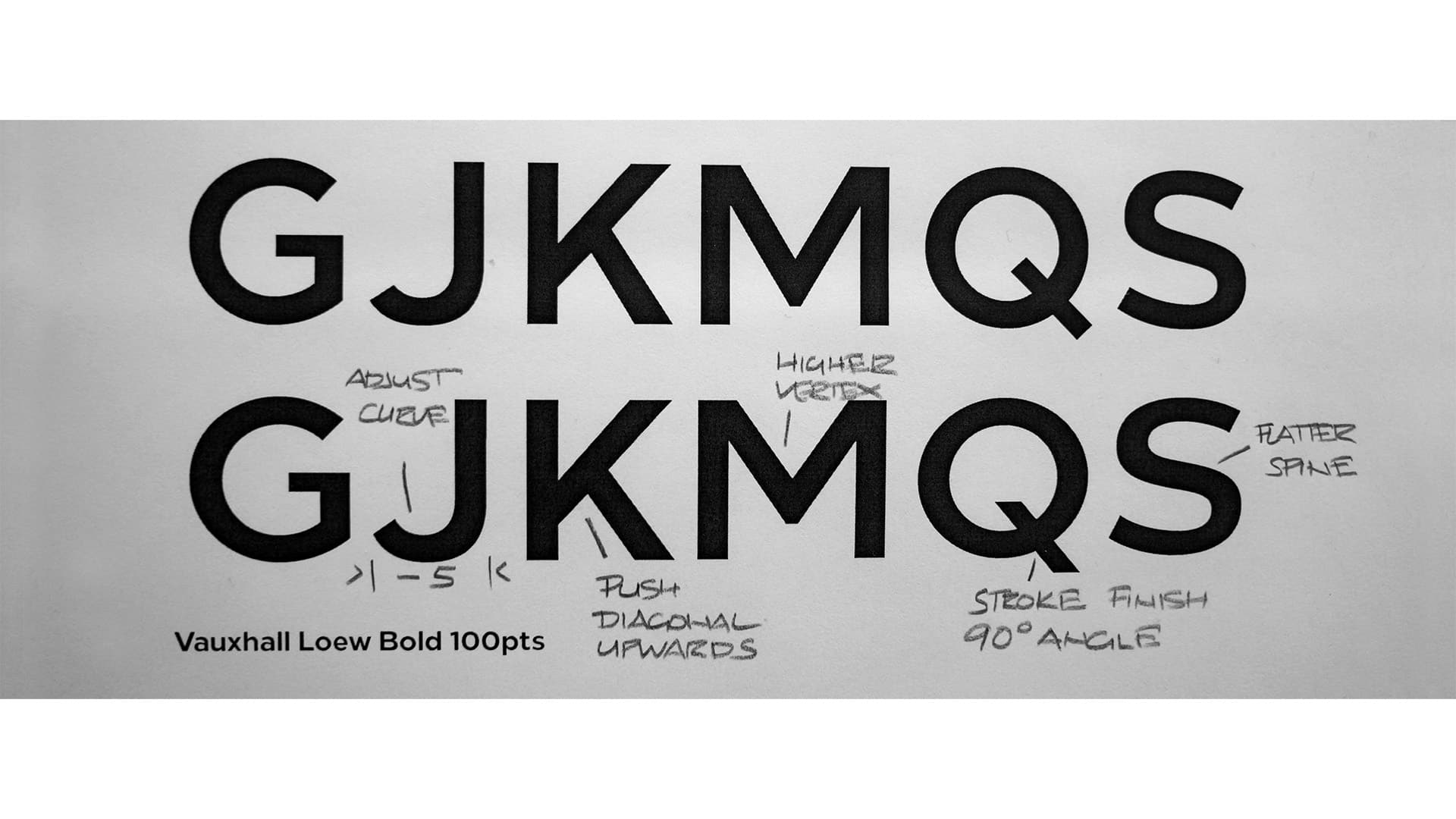
Today, The Northern Block are preparing for the release of their Loew font in variable.
Loew is one of its most popular corporate fonts. The idea behind it was to create a “basic, functional corporate, though striking font.” Then Vauxhall Motors called….
Hill explained that the font’s attraction was its “deliberate conformism.”
This also attracted Hilton Worldwide, which used it across its global marketing campaigns.
“The evolution of the Loew font owed to Raymond Loewy’s influence has steered us towards creating a typeface that juxtaposes efficiency, unadornment and making things purposeful. We liked the industrialist’s passion for making the everyday object fit for purpose and that attraction is equally about usability as it is style,” he said.
Since its launch, the company has been asked how much the font can be changed – “whether the shapes could be sturdier, less mechanical and match complex writing systems such as Arabic, Chinese, Japanese and Korean.”
They hope the Loew Variable release will answer some of these questions.
We use cookies to ensure that we give you the best experience on our website. If you continue to use this site we will assume that you are happy with it.