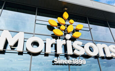


Leeds brand and design consultancy, StormBrands, has continued its partnership with Morrisons to redesign the supermarket’s organic range of products.
The redesign, which launches just as the Soil Association’s Organic September campaign draws to a close, follows a wider strategic update to Morrisons health and wellbeing portfolio which included the successful relaunch of both the Counted and the Free From ranges delivered by Storm earlier in the year.
Storm was briefed to rejuvenate Morrisons entire organic offering in line with a refreshed brand positioning and changing consumer behaviour around consumption of organically produced products. The agency was also asked to help educate consumers on what organic stood for by defining a distinctive and disruptive identity that would appeal to a growing spectrum of cross-generational customers, attract those keen to trial organic produce and convert occasional users through an easy to navigate value proposition.
Consumer demand for organic products is extending beyond traditional fresh products such as vegetables, meat and dairy, and although price remains a barrier versus perceived organic benefits and more indulgent ranges, generally organic is seen as offering a superior taste experience and a more natural food choice.
Storm needed to create a design solution that offered a clear value proposition and articulated the benefits of choosing organic, so its new creative proposition positions organic not as a process but as something much bigger, a mindset or lifestyle where everyone is welcome to play their part. It attempts to stress that if we look after the earth and replenish the soil, we look after each other, now and in the years to come.
The resulting design “showcases a new organic illustration championing the rich, diverse layers of our environment and how it connects to everything we do.” The organic colour palette and range navigation uses natural earthy colours linked to the landscape while the label layout has an artisanal ‘batch’ feel. Each variant has its own colourway comprising three tones: a light top layer, an earthy core and a rich base.
Zoe Phillipson, StormBrands’ creative director said: “We’ve elevated the Morrisons organic range from following legacy category codes at a value for money price to setting new standards that respond to increasing consumer experimentation and aspiration around food, diet and supply chain. The resulting design system is fresh and contemporary with a beautifully crafted logo that encapsulates the Morrisons organic brand story.”