
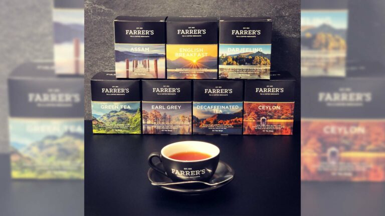

Farrer’s of Kendal has revealed its new packaging, inspired by the Lake District countryside.
The firm worked with Kendal-based design studio, Cactus Creative, to produce new designs for 7 teas within its range.
“We really felt it was time to update the packaging designs in our teabag range and we couldn’t be happier with the designs the Cactus team have created,” said Dave Walsh Farrer’s General Manager.
“As a company we’ve had so many successes over the last 200 years, and we wanted to create a range of designs that would take us forward into our third century of business. We hope to strengthen the strong emotional ties people have to Farrer’s by remaining true to the landscape that inspires us, whilst forging relationships with new tea drinkers by bringing a sense of adventure to their tea-drinking experience.”
Matthew Richardson, Creative Director, Cactus Creative explained that this was the culmination of a year-long rebrand for the firm.
“Between them, the images encapsulate the variety of this ever-changing landscape at different times of the year. Individually each blend features a time and place that reveals something of its essence. Green Tea is represented by the lush Langdale Valley, Darjeeling brings us a crisp bright Derwentwater and English Breakfast finds the midsummer sun breaking over Wastwater. We all have our favourite teas and parts of the Lake District and we hope these designs inspire people to find new ones.’’