


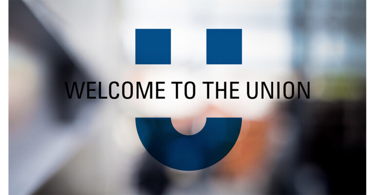

Holden & Sons has revealed the new brand identity for Manchester Metropolitan University Students’ Union.
 It won a competitive pitch for the project, which will appear throughout the new £10m purpose built Union.
The brief included a review of the name, organisation logo and strapline, brand architecture and brand guidelines.
The result is “The Union” with the “smiley” logo intended to “break the barriers and typefaces and language.”
Managing director, Ted Holden, explained that they wanted the brand to be “welcoming and inclusive” as well as having guidelines versatile enough to be used across all parts of the Union:
“As students complete their studies and move on, there is a significant turnover in the main target audience, so by allowing the logo to be changed with the creation of unique ‘avatars’, it means the identity can be constantly refreshed, and the ownership of the brand passed on to new students each year,” he said.
Holden & Sons were also involved in the wayfinding system and the design and fit-out of key social spaces within the new building.
There are almost 40k students at the university in campuses across Manchester and Cheshire.