


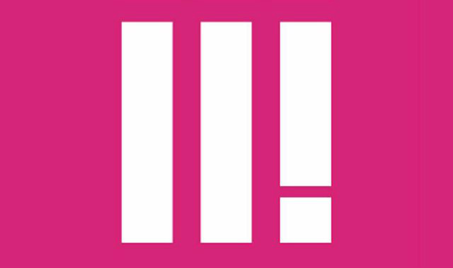

It may look like BBC 2! in Roman numerals, but here is the new logo for BBC Three.
The logo – consisting of two vertical lines and an exclamation mark on a bold pink background – has been revealed ahead of the channel’s move to an online-only platform, with February 16th today confirmed as the switchover date.
Perhaps predictably, the logo immediately drew ridicule and derision on Twitter, with some criticising it for having neither a 3 or a III in it.
Pre-empting some of the criticism, BBC Three head of marketing Nikki Carr defended the unusual design.
She said: “What is most striking is the new logo and the fact it doesn’t actually say three. It’s easy to belittle the importance a logo has in supporting a brand, and I’m sure the usual critics will have their say – “It looks like Adidas”, “it looks like a “hamburger menu icon,” “it doesn’t even say three”, “are they Roman numerals” – but If I’m being honest I’m not worried.
Watch the new BBC Three trailer:
“Some people are resistant to change and we wanted to be bold and create something that looks forward and will be around for years to come.
“BBC Three’s logo hasn’t changed in 8 years so in an age of smartphones we needed a whole new system that fits the digital world, not something analogue just shoehorned into it. We needed to develop something that worked on a TV screen and as an app icon. Look at Snapchat. They’re doing okay without having Snapchat in their logo.”
Plans to make BBC Three an online-only channel were finally approved by the BBC Trust in November, with the move expected to save the BBC around £50m a year.
The new logo in full: