

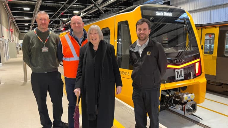

The pioneering graphic designer who created the Tyne and Wear Metro’s famous yellow logo, Margaret Calvert, has made her first ever visit to Newcastle to see her iconic typeface on the network – 44 years after it opened.
Calvert drew the solid font which became the instantly-recognisable symbol of Metro when it opened in 1980.
The designer, who did much to shape the visual identity of modern Britain, travelled from her home in London last week to finally view her Metro logo and Calvert font typeface on the Newcastle system.
Calvert designed the large yellow Metro ‘M’ cubes outside stations, on trains, and throughout signage within, including giant wall graphics on underground Metro platforms.
Nexus, the public body which runs Metro, said it was honoured to invite Calvert, now in her 80s, to view her work on the transport system.
It included a visit to the Nexus Learning Centre in South Shields to see her logo on the new Metro train fleet.
She took a short journey on the Metro through Newcastle city centre to see her typeface at some of the best-known underground Metro stations – Jesmond, Monument, Haymarket and Central – which formed part of the original Metro network when it was first built.
Huw Lewis, customer services director at Nexus, said: “It was a huge honour to welcome Margaret Calvert on the Tyne and Wear Metro to see her design work at first hand, on our stations in Newcastle, and on our amazing new trains.
“This is the woman who created Metro’s iconic typeface, which is at the very core of the brand. The Metro logo has become one of our region’s most iconic symbols and that was all thanks to Margaret’s work for us in the late the 1970s.
“The visit was her first ever chance to see her designs on our underground stations through the centre of Newcastle, which I know was a particular thrill for her. More than 40 years after she created that familiar Metro logo she got the chance to see how her work has shaped Metro.
“It’s a design which has stood the test of time. Margaret’s work for Metro, both the font and the way it is used throughout the system, will be with us for many years to come.”
Calvert had previously visited Sunderland in December 2021, where she got the chance to see her designs at some of the Tyne and Wear Metro stations in the city, but had never previously managed to see her work in Newcastle.
Carvel’s work isn’t only familiar to regular North East Metro users. Her work with Jock Kinneir has defined our roads, rail stations, and airports, while her work with Kubel has changed the face of the Gov.UK website and Britain’s railways.
Calvert’s collaboration with Kinneir on the design of Britain’s road signage system started with the motorways in the late 1950s and early 1960s, and finally came into effect on 1 January, 1965, with the all-purpose roads.
For the Tyne and Wear Metro she used her own lettering for the signing system, which is now marketed under the name ‘Calvert’, for Monotype. Her most recent project has been the design of Rail Alphabet 2, in collaboration with Henrik Kubel, for Network Rail.
Her long association with the Royal College of Art, from 1966 to 2001, included a full-time appointment as head of graphic design from 1987 to 1991, and she was awarded an Honorary Doctorate by the Royal College of Art in 2016.
Calvert’s work, including her designs for the Tyne and Wear Metro, was celebrated in an exhibition at London’s Design Museum in 2020.