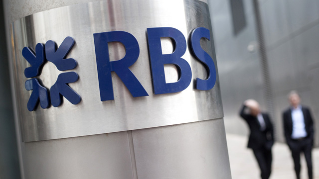

Royal Bank of Scotland is planning a new logo as it looks to shake off the tarnished image it acquired in the wake of its 2008 bail-out.
The bank is to axe its bold upper-case acronym and introduce a softer, more modest lower-case version.
Changes have already been rolled out north of the border, where the full Royal Bank of Scotland name is now used on the high street.
The rebrand reflects a slimming down of the bank, which employs hundreds at its 140,000 sq ft building on Deansgate in central Manchester.
As a condition of the £45bn in state aid it received during the crisis of 2008 and 2009, RBS has been forced into divesting itself of 308 RBS branches in England and Wales and six NatWest branches in Scotland.
Next year these branches will be relaunched under the revived Williams & Glyn brand and listed on the stock market, with Manchester set to be its head office.
On the proposed rebrand, an RBS spokesperson said: “We are, and always have been, a bank of brands and as part of our strategy to build a stronger, simpler, fairer bank we are directing our efforts to make each of our customer brands number one in their respective markets.
“Our brands are our interface with our customers and through them we will be able to connect more deeply with customers and rebuild pride in the great things these brands do for our customers. The collective success of our brands is what will make us Britain’s best bank.”