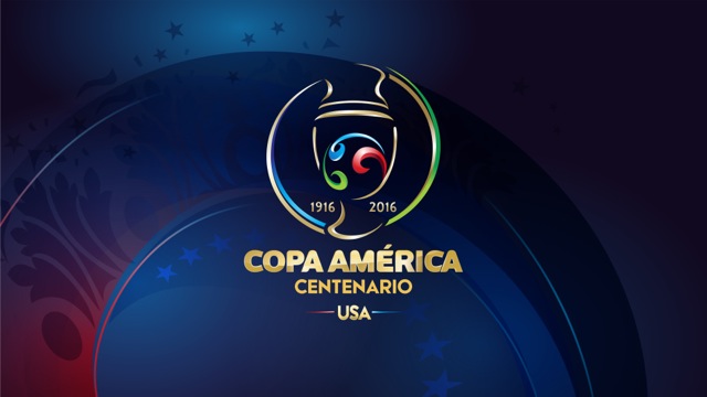
Leeds agency, Works has produced the brand identity for the 2016 Copa America as the competition celebrates its centenary.
The tournament takes place in the USA in 2016 and will be the biggest sporting event to be held there since the 1996 Olympics.

A football is at the centre of the new design, which is a modern interpretation of the trophy. The red, green and blue represents “the fans, the players and the many cultures across the Americas” all being drawn together by the game. The external rings show CONCACAF (Confederation of North, Central American and Caribbean Association Football) in blue and CONMENBOL (South American Football Confederation) in green.
The bespoke font includes a colour flash adopted from the host nation’s flag.
“We understand the huge significance in the sporting world of two confederations, CONCACAF and CONMENBOL, joining forces and that this will be the first time the competition has been hosted outside of South America. This is an exciting and historic moment for The Works’ inaugural football project ‘across the pond,'” said Paul Peppiate, business development at Works.
The agency has offices in Leeds and Sao Paulo in Brazil and its client list includes FIFA, UEFA, IAAF and the NBA.


